Updated: November 2021
When you are modelling a business problem in Excel, you will often want to know how the output of your model is affected by changes in some of the input variables. To do this you use sensitivity analysis, which is so called because you are measuring how sensitive the output is to changes in some of the input variables.
Generally, you will analyse two variables at a time, and see what value an output variable, such as profit, has for various combinations of those two variables. In Excel, it’s reasonably easy to construct a sensitivity table, which puts one input in the rows and another in the columns and displays a matrix of values for the output variable.
However many people, quite possibly including your managers or clients, prefer charts to tables, as it’s often much easier to see information quickly when it is presented visually. Unfortunately, constructing a sensitivity chart can be a bit trickier, so this post will show you how to do it.
Sensitivity Tables
Even if you intend to display your final results as a chart, you should create a sensitivity table first. As we will see later, a table is more flexible than a chart, so we will create our chart from a sensitivity table.
I’ve started with a blank table showing two factors of interest: booking limit and conversion rate. As you can see there is a range of possible values each variable can have. In our Excel workbook, we have created a model which includes these two variables, and several others, to calculate the profit for an airline. I haven’t shown the actual model here.
In the top left corner of the table, is the profit figure, which is the output of the model. Obviously, we want to maximise profit:

To create the sensitivity table, highlight the data table (not including the titles), go to the data tab and select what-if analysis, followed by data table. Moving along a row represents a change in the booking limit, so the row input cell is the cell in our model where the booking limit is stored. Similarly, the column input cell is the cell where the conversion rate is stored.
After adding some conditional formatting (found in the home tab), the table will look something like this:

Each cell shows the profit for a particular combination of conversion rate and booking limit. This is already pretty useful by itself. For example, we can see that a booking limit of 195 seems to optimise profits at all conversion rates.
Creating a Sensitivity Chart
When creating a chart in Excel, you generally should have the legend entries to the left of the data, and the axis labels on top or below. Our sensitivity table has this format.
If you’re familiar with creating charts in Excel, you might think that you just need to select the cells in the table and create a chart. Unfortunately, things are not that easy. The problem is that our row labels and legend labels are numeric, which means they get added to the graph.
The solution is to make a copy of the sensitivity table and convert the labels to text format. We copy the table because if we modified the original table, the table would be unable to recalculate the profit values if we changed the values we were using for booking limit or conversion rate. You’ll generally want to retain that flexibility, so it’s better to make a copy.

To convert the fields from a number to text, we use the text function. For the booking limits, which are whole numbers, we use the format “###”. For the conversion rate, we use the format “##.0%” to get percentages to one decimal place. I won’t go through all the details of the text function here, but you should be able to convert any number to text using it.
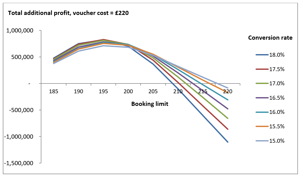
Having done this, we can create the sensitivity chart from our new table by selecting the data and creating a line chart. After a bit of formatting, the chart should look like this:

This presents the same information as our table, but in a graphical format. Again we can see that profits are highest at a booking limit of 195.
When to Use a Sensitivity Chart
If you are creating sensitivity charts, it may be easier to do so near the end of your modelling process, as it can be a bit awkward to be making copies of sensitivity tables. However, you can create sensitivity tables at an earlier stage, and it’s probably a good idea to do so.
You also need to remember that a sensitivity chart only studies two input variables at a time. Your models will almost certainly have many more variables which may impact on the output. You may want to see how a change in another variable affects your sensitivity chart, or create a few different sensitivity charts to see how other variables impact your model.
Conclusion
Sensitivity analysis is a nice way of seeing how your model is impacted when some of its variables change. You can actually get all the information you need from a sensitivity table, but using a chart is a great way to present your information in a more pleasing way that may get your model noticed more by managers or clients.

Featured image by rawpixel.com


