Charts and Dashboards
Build Your First Dashboard
If you’d like to visualize your data on a larger scale, dashboards are the answer. These offer a single-page overview of all the company’s KPIs and are accessible in nature. In this course, you’ll learn how to build an interactive dashboard, which can be viewed regularly as the numbers update throughout the year.
Intermediate 11 Lessons 120 Minutes CPD Credits
About This Course
A dashboard is a single-page overview of a company’s KPIs. The information is normally provided in tables, graphs and charts, so that senior members of staff can quickly see how departments products are performing.
Across 11 lessons, you’ll learn the most efficient ways of extracting insights from data and find out why and how companies build dashboards.
By the end of the course, you’ll feel confident in creating your own dashboard of your company’s KPIs to suit the audience of your project.

Learning Outcomes
-
Explain the purpose of a dashboard in Excel
-
Design the layout of a dashboard
-
Calculate the headline values of a dashboard
-
Add various charts to a dashboard
-
Add interactive charts to a dashboard
-
Add formatting to a dashboard
Lessons
1. Why Build Dashboards?
2. Designing Your Dashboard
4. Adding Charts to Your Dashboard
5. Time-Based Charts
6. Segmenting by Customer Size
Read More
7. Sales Team Analysis
8. Add Interactive Buttons to the Dashboard
9. Link Sales KPIs to Buttons
10. Ranking Metrics
11. Formatting Your Dashboard

Learning Certificates
Showcase Your Skills
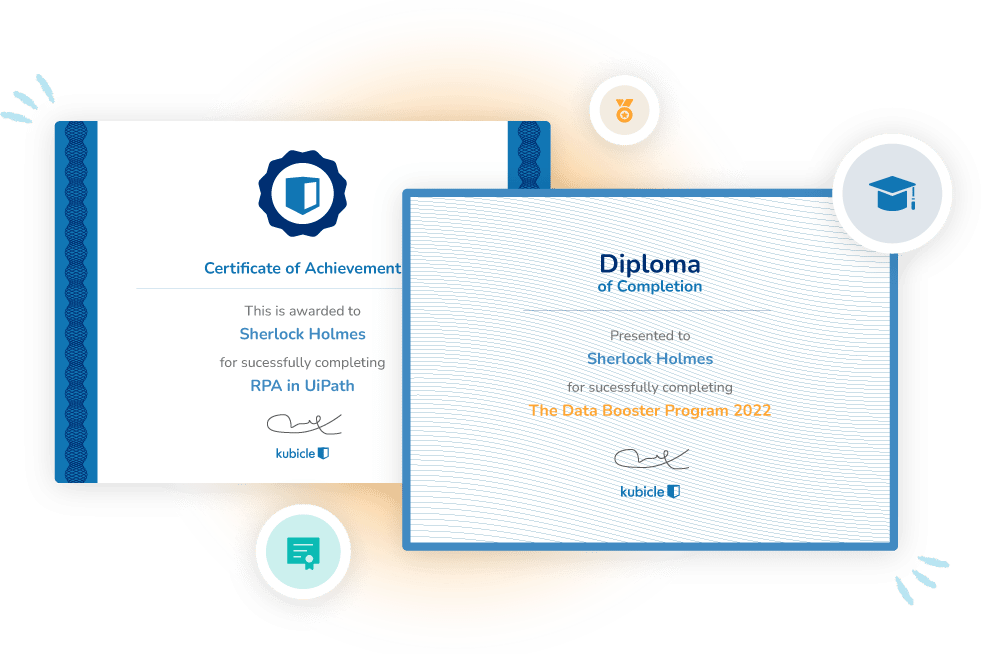
Each time you complete a course exam, you earn a certificate that demonstrates your proficiency in that subject matter. We are proud to be able to say that Kubicle certificates are recognized by the most respected employers from around the world.
When you earn internationally-recognized certificates, you increase confidence. And when you enhance your ability, speed and accuracy, you increase your employability.


