
As we explained in a previous post, a dashboard consists of a collection of charts and other visuals combined into a single screen interface. The choice of charts to use can have a big impact on the effectiveness of a dashboard. In this post, we’ll learn when to use some of the most common chart types that are found in most dashboards. We’ll also discuss some more general questions you should ask when choosing a chart.
Even if you don’t create dashboards yourself, the tips we’ll see here are useful if you read dashboards or if you present dashboards to other people such as clients or managers. You can use these tips to better understand the charts and dashboards you view, and can speak with much greater authority when requesting visual insights and dashboards from others.
Bar and column charts
Bar and column charts are among the most common charts used in dashboards. A bar chart presents data as a series of horizontal bars, while a column chart displays data as a series of vertical columns.
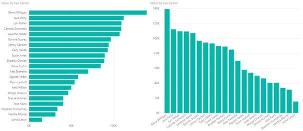
Here we see information on the value generated by each fee earner in the data set. On the left is a bar chart, on the right is a column chart. Note that the charts we will see have been created in Power BI, however the principles we are discussing can be applied to any software used for generating charts and dashboards.
Bar and column charts are fairly interchangeable. The only exception would be for time based data, where time should be on a horizontal axis, which means using a column chart. Bear in mind with time based data that it may be a better idea to use a line chart, as we’ll see later on.
Stacked vs Clustered
There are two types of bar and column chart. A stacked chart breaks each bar or column into different segments, stacked on top of each other. A clustered chart creates different segments and places them alongside each other.
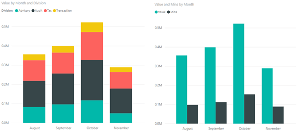
On the left is a stacked column chart showing value generated per month, broken down by division. On the right is a clustered column chart showing the total value generated and the total number of minutes worked every month.
The main thing to consider when choosing between a stacked and a clustered chart is whether it make sense to add the individual components together. In our stacked bar chart, adding the value for each division gives us the total value generated, which is a sensible metric in itself. In this situation, a stacked chart is appropriate. In the clustered chart, adding value and minutes together does not produce a sensible result, so a clustered chart makes more sense.
Line Charts
Line charts are mainly used for time series data, in particular for situations where there are a large number of data points. If you have a smaller number of points, then a column chart could also be an option, as seen with the stacked and clustered column charts seen above.
Below we see a line chart showing the total value generated by week for each division. In this case, the number of weeks in the dataset is too high for a column chart to work well, and the line chart works better.
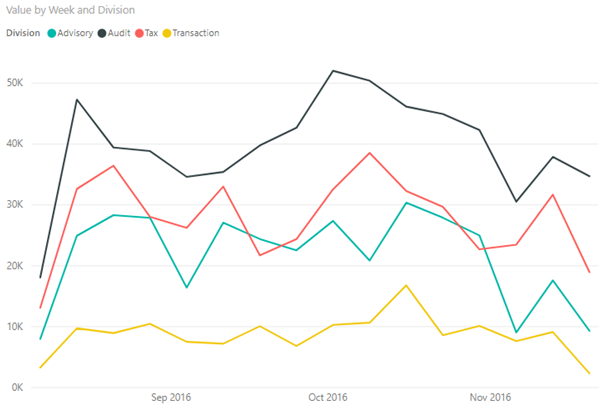
Choosing a line or a column chart is also influenced by the perspective of your graph. Line charts work well where your focus is on trends over time. A column chart might be more useful if your focus is on identifying specific numeric values at a particular point, but even then a line chart is not a bad choice.
Pie Charts
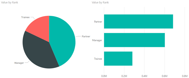
People with some experience of creating visualisations may well be aware of the reputations surrounding pie charts, however for a general audience, an explanation may be required. Pie charts are often criticised because it is difficult to compare the size of angles.
Below is a pie chart showing the value generated by rank in our consulting firm. With the pie chart, it’s not immediately obvious which slice is largest, and it’s not easy to compare the size of each slice. In this case, you can probably figure it out after looking for a few seconds, but this won’t always be the case. In any event, remember dashboards should be viewed at a glance, and should require little or no interpretation on the part of the reader.
By contrast, with the bar chart, it’s easy to see which bar is largest, and it’s easier to interpret the gap between bars at a glance.
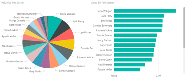
Pie charts are also a poor choice if you have a large number of categories. Below we can see two charts of the total value generated by fee earner. The pie chart is a complete mess, and has so many slices that it is impossible to derive any insight from it. The bar chart makes it much easier to compare fee earners, and measure the value generated by each fee earner, even if it requires a scroll bar in this case.
Tables
Tables are a type of visualisation, and can be popular if your manager or client likes numbers instead of charts. However, tables should not be added to dashboards. Searching through a table to find the figures of interest generally takes effort and time. This does not fit in with the notion of reading a dashboard at a glance, and so should be avoided.
Visual Effects
Nowadays, we have bespoke software for creating charts and dashboards. However, there was probably a time when Excel charts were the height of advancement. If you can remember that era, you may be familiar with 3D charts, shadows and all the various visual effects that Excel is capable of adding to charts.
If you are in any way tempted to use effects like this, you should resist these temptations strongly. Effects like these are generally poor practice, as they usually distract from the key message of the chart, and can often make it more difficult to read. Remember the most important part of a chart is the data and the insight. Making the chart look pretty should be a secondary consideration.
You’ll generally find that modern dashboard software like Tableau or Power BI does not support effects like these, so we won’t show any examples of them here. However, if you really must see what not to do, you can take a look at this post about 6 Common Chart Mistakes To Avoid When Presenting Data.
General Chart Selection Tips
In this post, we’ve only covered a small selection of the chart types that you can use on a dashboard, so we’ll finish with some general tips on chart selection.
When considering what kind of chart to use, consider the purpose of the chart. Some charts are better suited to specific purposes, for example the line chart is best suited to time series data, as we saw previously.
As we mentioned previously, the primary focus with any chart should be on presenting the relevant data effectively. The appearance of the chart should be of secondary concern. This is not to say that you should avoid creating innovative and different visualisations, however you should make sure that they are effectively communicating the message you want to get across.
Conclusion
In this post, we have learned how to choose the right type of visualization in various situations. Selecting the right charts obviously makes a big difference in putting together an effective dashboard. In the next post in this series, we’ll learn how to layout a dashboard once you have created all the visualizations of interest.
{{cta(‘b1d29f36-2e97-4b52-8dcf-e6e4675c16cf’)}}