
When you’re modeling a business problem, it’s generally tempting to start the analytics as quickly as possible. Whether you’re using Excel or another promising new tool, this can be a bad idea. You should always spend some time structuring your model in order to understand the variables and how they interact with each other. Influence models can be a good way of doing this. In this post, we’ll cover the main components of influence models.
An influence diagram is a graphical representation of all the inputs, variables and outputs of a business process. It can be used to experiment with different model structures without having to worry about low level details at an early stage of the process. By visualizing the model, you can quickly get an idea of what the model structure will look like, before you start any technical work.
Understanding the Elements of an Influence Diagram
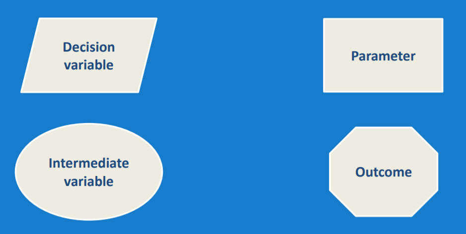
Influence diagrams are made up of four different types of node, connected by lines. These four node types are:
- Decision variables: These are inputs to the model that the company has total control over. An example would be the price of their products.
- Parameters: These are inputs to the model that the company does not control or only partially controls. An example of this would be the market growth rate.
- Intermediate variables: These are fields that are calculated using formulas. They can be calculated from decision variables, parameters or other intermediate variables.
- Outcomes: These are the final fields or outputs from the model. An example of this would be total revenue.
Each of these nodes is represented by a different shape on the influence diagram. Decision variables are represented by parallelograms, parameters by rectangles, intermediate variables by ovals, and outcomes by octagons:
Creating a Simple Influence Diagram
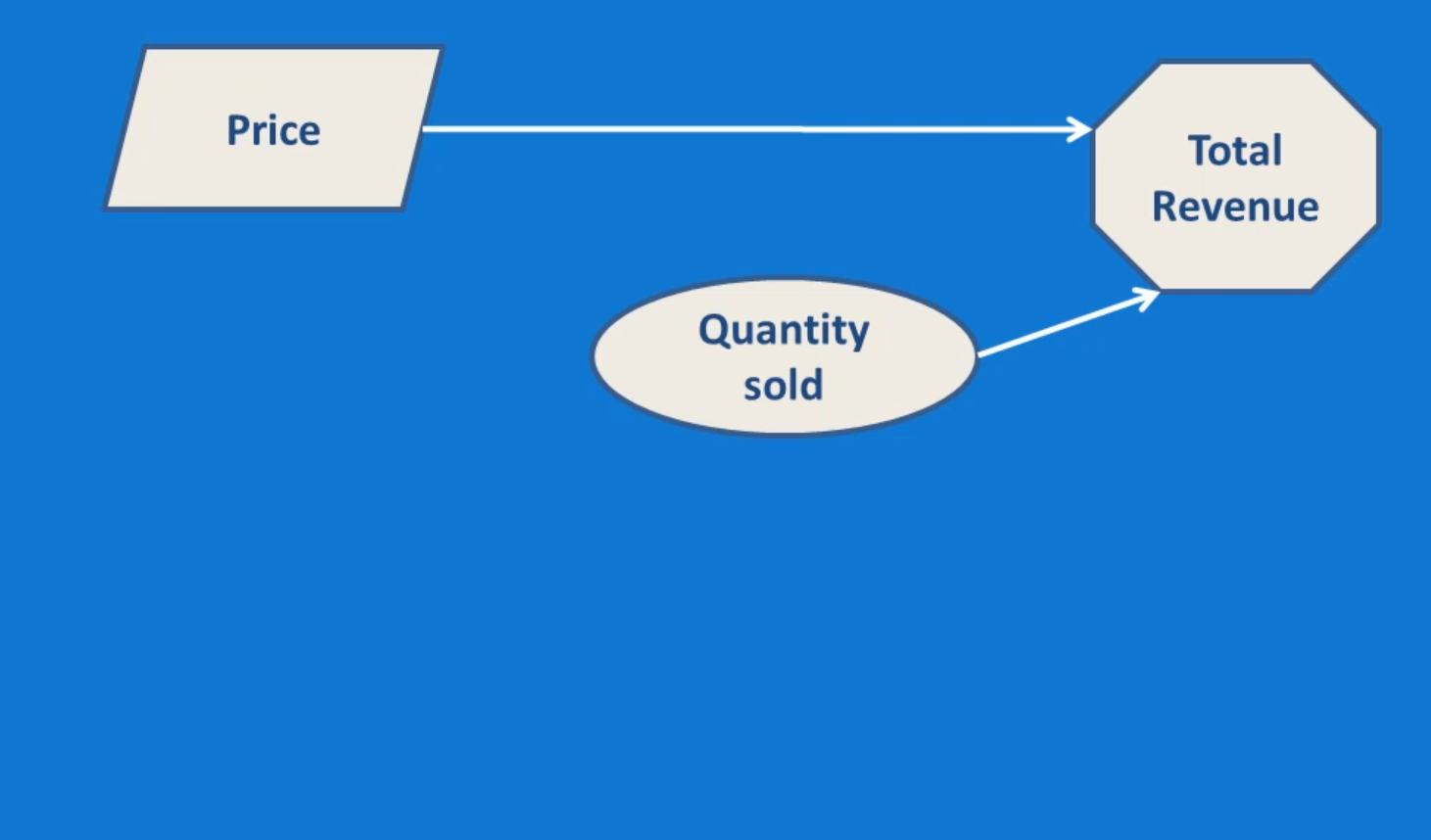
Let’s look at a simple example of an influence diagram. We’ll model the Total Revenue for a manufactured product. When creating an influence diagram, it’s often easiest to start at the end, and work backwards. Therefore, we start with Total Revenue as an outcome on the right of our diagram, as seen below:

Next, we need to consider how revenue is determined. In this case, revenue is price multiplied by quantity sold, so our next step will be to add these two variables. Price is a decision variable, as it’s controlled by the company, while quantity is an intermediate variable, which is not controlled by the company. Instead, quantity sold is determined by the demand for the product. This gives us the diagram below:
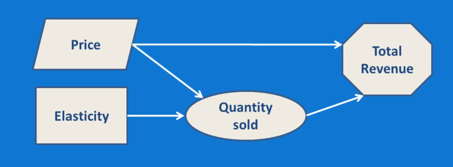
Demand, and therefore the quantity sold, is a function of price and price elasticity. Elasticity measures how responsive the quantity sold is to price changes. Elasticity is an input that the company cannot control, so we include it as a parameter. Price is already in our model, so we can link it to quantity sold, which gives us the final model that we can see below:
Adding More Complexity to Our Influence Diagram
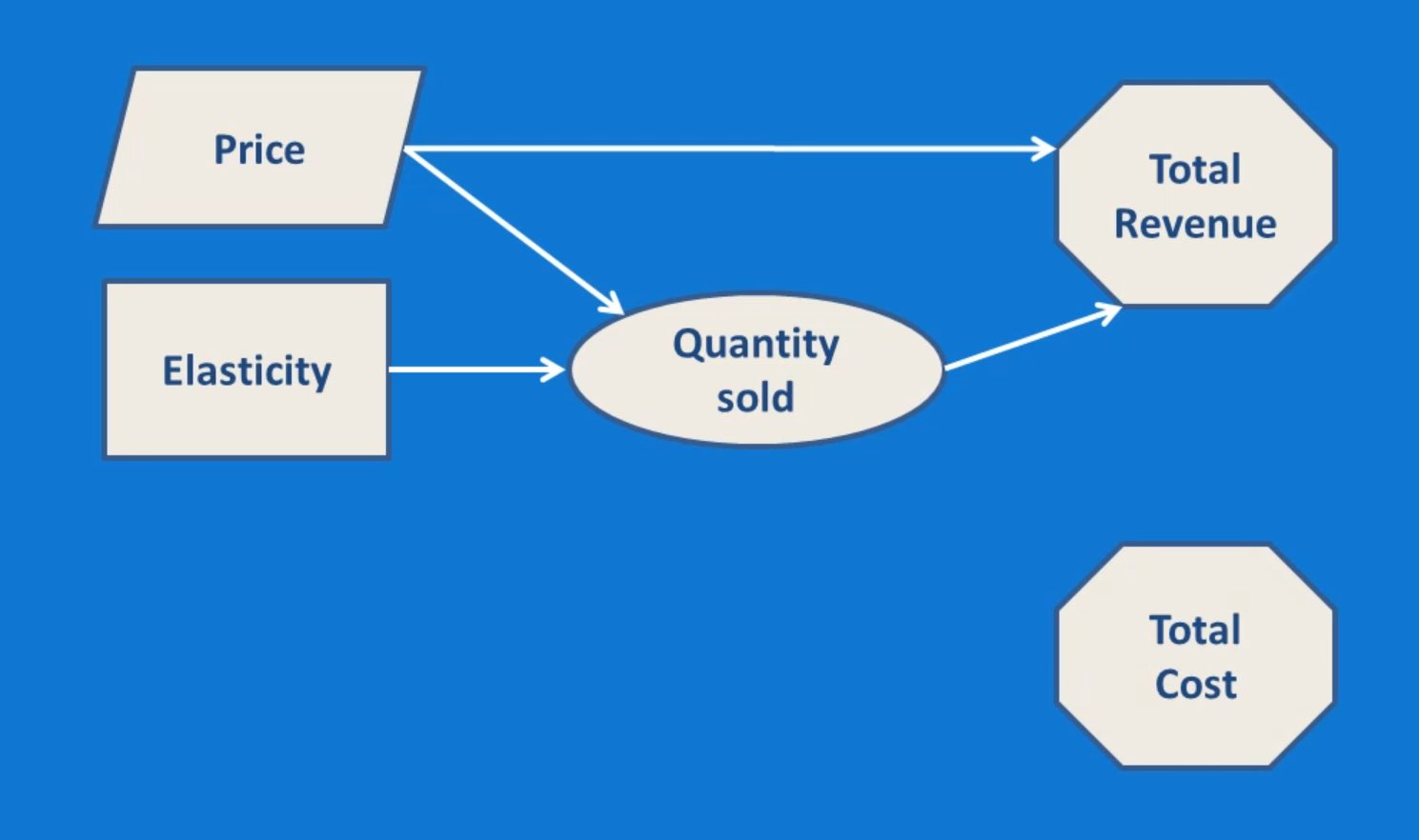
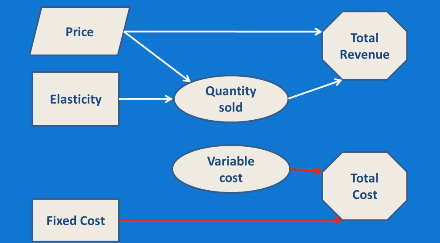
The model above is good, but revenue is only half the story for any business. Let’s add costs to this diagram, and then combine the outputs to create an influence diagram for total profit. We’ll start by adding Total Cost as another output, as seen below:
Total Cost is equal to variable costs plus fixed costs. Fixed costs include things like rent, light and heat. At least in the short run, the business cannot control these costs, so we’ll include them as parameters. Variable costs will be included as an intermediate variable:
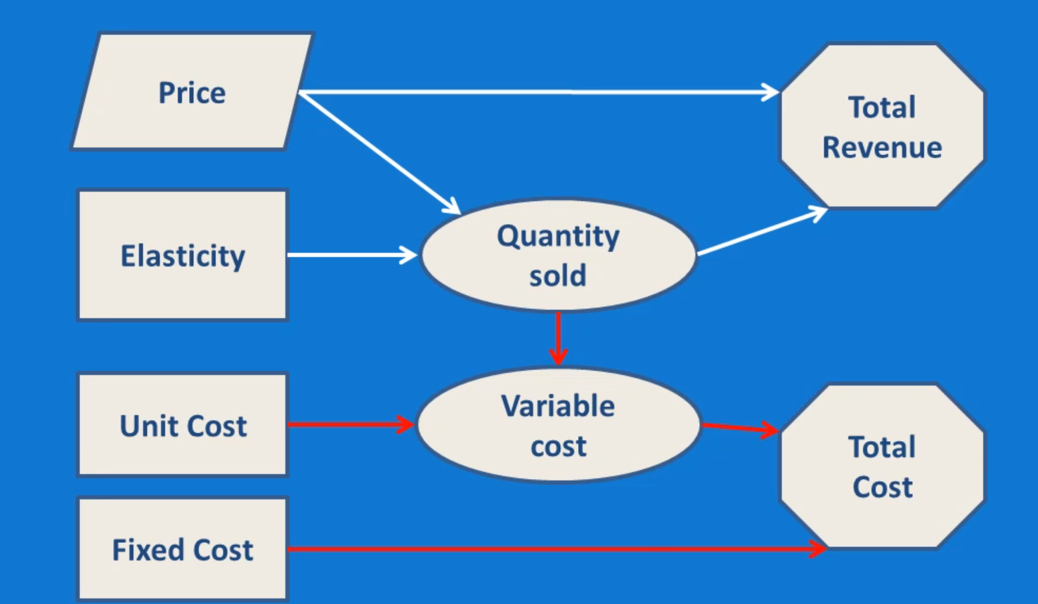
Variable costs are determined by unit costs and quantity sold. Unit costs are a parameter, as they will be dependent on agreements with suppliers, which probably cannot be changed, at least in the short run. Quantity sold is already in the revenue model, so this provides a link between the revenue and cost sides of the diagram. This gives us the model below:
In order to finish off the model, we’ll add an outcome node representing total profit, which is a function of total revenue and total cost. When we add this node, the nodes for total revenue and total cost will no longer be model outputs, so we’ll change them from outcomes to intermediate variables. This gives us the final model output which we can see below:
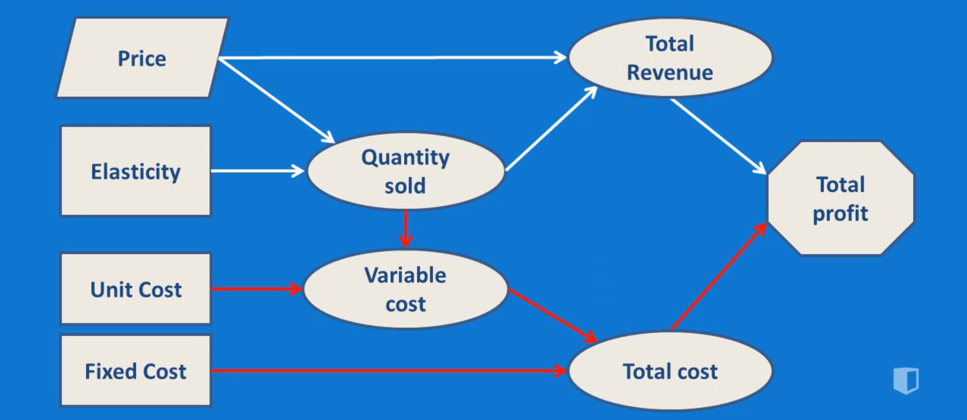
The final diagram contains two major, linked sections: one representing profits and the other representing costs. As we can see, the influence diagram provides a quick way of getting to understand the problem of calculating profits.
Conclusion
An influence diagram like this is a visually appealing way of getting to know the various fields involved in the model you intend to put together. It takes a little bit of time to complete, but once it’s done, you’ll find it much easier to create the profit model in Excel, or whatever other tool you might be using. You can also be more confident that the model you put together is fully representative of the process you’re modeling.
A problem like this is relatively straightforward. With a real business problem, your influence diagrams will probably be larger and more complicated. In those situations, an influence diagram is even more important and is an invaluable step in the modeling process.


