In the last post on dashboards, we saw how to select the appropriate chart for a given situation. Now, we’ll move on to the next phase of the dashboard creation process, and learn how to lay out the dashboard when we have created all the visuals we need.
We’ll look at a default dashboard for our consulting firm, Srentrap Partners. We’ll then improve the layout of the dashboard in several steps, illustrating a number of important principles that you can apply when laying out dashboards. As with the previous post, the visuals and dashboards illustrated here were created in Power BI, but the principles could be applied to Tableau or any other software.
Start with the basics
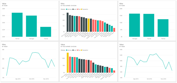
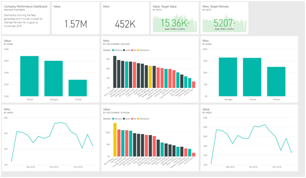
Below, we see an initial attempt at creating a dashboard for our consulting company, Srentrap Partners. The dashboard contains several charts focusing on the value generated by the company’s fee earners over a period of several months, and the number of minutes the fee earners worked in that period.
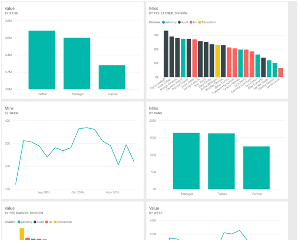
Firstly, let’s deal with the simplest, but most important issue. Currently, the dashboard does not fit on a single screen. The last row of charts runs off the bottom of the page. Remember screen sizes can vary, but let’s assume that we are using the same computer that will be used to present to the executives. As a result, we’ll want to change the layout of this dashboard so that all the charts fit on a single screen. We can see the results of this below:

Another issue we want to consider at this point is chart alignment. On a dashboard, charts should generally be aligned in a neat manner. An organised dashboard is generally easier for viewers to understand. We also need to consider spacing between charts. We would want to leave a small amount of empty space between each chart, to avoid any overlap, but this gap should not be so large that it wastes space on the dashboard.
When you use a dedicated dashboard creation tool, these issues will generally be dealt with by the software. For example, Power BI dashboards have a tiled layout, where each chart occupies a number of tiles. As you can see, there is a reasonable space left between each chart.
Know what to leave out
An important point to consider when designing dashboards is the number of charts to include in the dashboard. Often, you will want to avoid including every single detail that might be of relevance in a dashboard. The dashboard should provide the headline figures that are most relevant to the company and the readers of the dashboard. Supporting information can then be supplied in reports or sheets underlying the main dashboard.
For example, below we can see two of the charts from our dashboard, showing the number of minutes worked by fee earner, and the number of minutes worked by rank. The first chart is color coded by division. We could provide a separate chart showing the number of minutes worked by division, but in this case it’s not actually necessary. We can tell by looking at the Fee Earner chart that the Audit division has worked the most minutes, and it seems the Advisory and Tax divisions have worked fewer minutes.
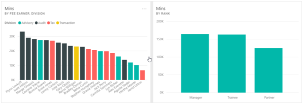
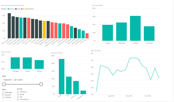
In this case, we can place a chart of minutes worked by division in a report underneath the dashboard. In Power BI, users can select a chart from the dashboard and get taken to an underlying report. Below we see the report that links to the charts on minutes worked. This report contains several extra charts not included in the dashboard, as well as slicers that allow viewers of the report to analyse the data for specific ranks, divisions or date ranges. In this way, the dashboard provides an overview of the relevant information, with the details available elsewhere for those who want to view or analyse them.
Add headlines to the dashboard
The dashboard we have seen so far includes only charts. Often a dashboard will include a few standalone numbers at the top of the dashboard. These can include a few key figures that are most likely to be relevant to the audience.
Below you can see our dashboard after we have added a few cards to the top of the dashboard. The first card is a title and gives a short overview of the dashboard to anyone who might not be familiar with it. There are then cards giving the total value generated and the total minutes worked for the whole dataset. Finally, we have cards tracking daily revenue and daily hours worked and comparing their values to a company target.
Adding headlines like this can make it easier still for dashboard readers to quickly obtain some insights into the company’s performance.
Present information in a logical order
A final consideration when laying out the dashboard is where to place the visualizations. The dashboard can be thought of like a written document, in particular like a news article. The most important stuff should be at the top, with details, and supporting information further down. People will often “read” the dashboard from top to bottom and from left to right like a written document, so your layout should facilitate that.
Our dashboard already works well in this regard. The figures in the top row are the headline figures, and the charts below provide more information on those numbers. However, the charts themselves are currently laid out slightly at random. It would be more logical to place all the visualizations relating to value generated on one row, and all the visualizations related to minutes worked on another row. Below we see the dashboard after rearranging it like this.
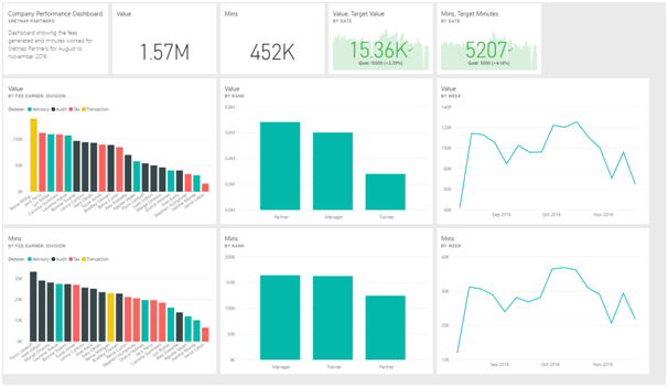
This makes the dashboard look a lot neater, and provides more continuity to each row of charts, making it easier for a viewer to “read” through the dashboard.
Conclusion
By now we have seen the importance of selecting the right charts for a particular situation, and seen how to create an effective dashboard using those charts. There are still several more design tips that I have yet to cover in the coming weeks so stay tuned!


