They say that a picture is worth a thousand words.
Graphs and charts are wonderful things. They give you the power to explain what’s in your dataset while requiring you to write only a small amount of dreary text. However, with great power comes great responsibility. It’s all too easy to create visualizations that are confusing or downright misleading if you don’t know what you’re doing. Here are a few suggestions that might help you avoid some common visualization traps.
1. Don’t Truncate the Axis
Bar and column charts are common for graphing numeric data. Usually viewers compare the size of different bars to find some insights. The column chart below shows sales value generated by some sales people.
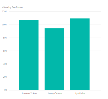
Clearly, Lenny isn’t doing very well, is he? Look how small his bar is. Maybe we’ll have to fire him. But now notice the y-axis only starts at 90,000. That doesn’t make sense. Let’s try it with the y-axis starting at zero, as it should be.
Now the gap is much smaller. When you truncate the axis, you make small differences seem much larger than they really are. Here we see that Lenny is actually doing reasonably well. In that case, no one will be fired after all.
2. Don’t Overslice the Pie
The pie chart seems to be a particularly rage-inducing chart in some quarters. Many people loath pie charts with a passion that really doesn’t make sense. It’s only a chart. I think there are a small number of situations where they can be useful, but a large number of situations where they are not. I will offer one piece of advice.
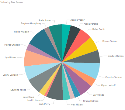
Only use pie charts with a small number of slices, no more than three or four. Any more and the slices will almost certainly be too small or similarly sized to make useful comparisons. Below we see the sales generated by all the sales people in our company. The number of useful insights that can be gleaned from this monstrosity is zero. Don’t even think about using a pie chart when you have a lot of data points like this:
3. Choose the Right Level of Detail
Many presentations or reports will start with some kind of headline figure, like the one below:
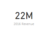
A single number like this only raises many questions. How did the revenue break down by location, by product, by sales person? How does it compare to previous years? Was it in line with targets? Was the performance relative to target consistent across locations, products and so on? If you are creating a report or a presentation, make sure that you answer all of these questions. It will never be the case that one number represents the answer to everything. Not even 42.
4. Label Your Charts
A visualization is not just about pictures. Text, annotations and labels are all as important in getting your message across. The graph below breaks down sales for some of our sales people by region.
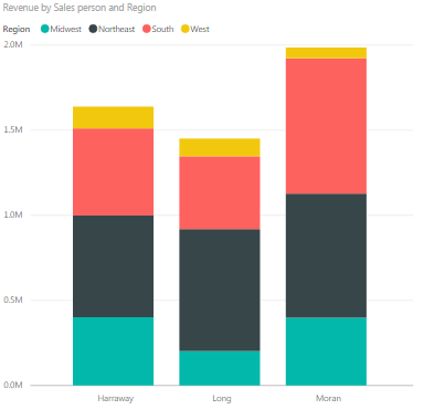
This graph is fine if you just want to get a rough idea of what regions and sales people are doing best, but it’s no good at all if you’re interested in specific numbers. Now look at the same graph with some simple data labels added to it.
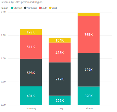
The data labels make it much easier to make comparisons, as we no longer have to try and compare the sizes of various bars ourselves. More often than not, a chart is about numbers, so often the best way to tell your viewers what the numbers are is adding them to a chart.
5. Don’t Confuse Viewers
Don’t scroll down any further! This one works well as an experiment, at least if you haven’t seen it before. The graph below shows gun-related deaths in Florida. Take a look at the line and try to quickly find out what happened to gun deaths in 2005, when the “Stand your Ground” law was introduced. Did they increase, decrease or stay the same? Then scroll on.
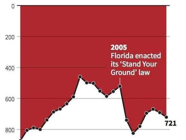
Deaths decreased, right? Well, no. Go back to the graph and look at the y-axis. You will see that it is upside down, with 0 at the top, which goes against every graphing convention in the book. So gun deaths actually increased after 2005.
We all have certain expectations of graphs. For example, we all expect the y-axis to increase as you go up it. Never defy these conventions, as you will only confuse or mislead viewers.
6. Don’t Make Chart Fancy
This one is primarily, but not exclusively, for the Excel users. Excel likes to give you options to embellish your charts with 3D and other special effects. You should never, ever use these options. If you can tell from the chart below that the South region is almost the same size as the Northeast region, then your eyes probably work in a different way to mine.
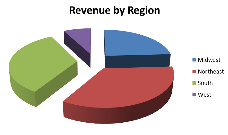
Remember the focus of your chart should be the information within it, not the chart itself. If a simple chart conveys your information effectively, keep it simple and use it.
Conclusion
Graphs are central to most data analysis work. However, there are a great many ways in which graphs can be misused. Hopefully, these tips have given you an idea of a few pitfalls you might encounter when creating charts. Remember that charts are just a method of presenting results of data analysis. If you keep most of your focus on the actual results you are trying to show, and less on creating a work of art chart, you will be able to work with charts effectively.


